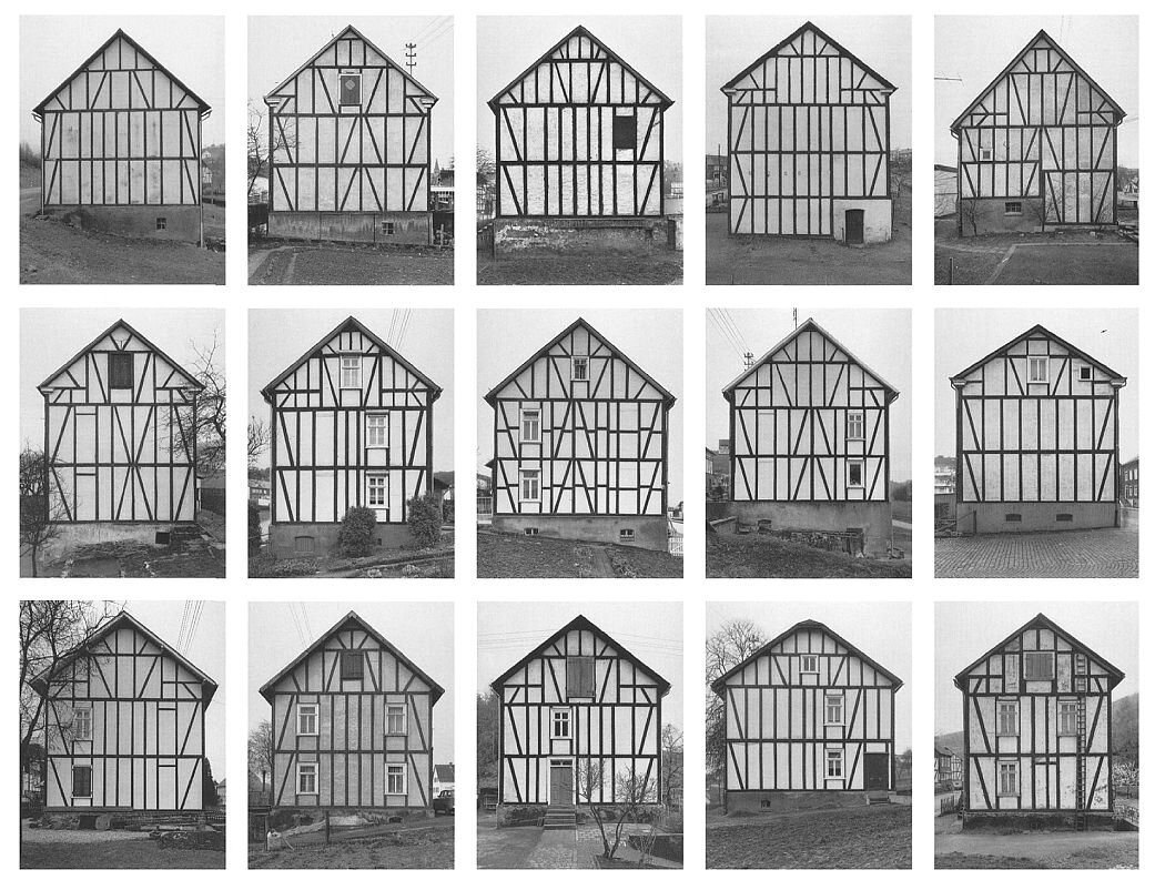
My masters project while at the UH College of Architecture and Design was a quasi-scientific study on light and its effects on the way we see architecture. At the beginning of the fall semester all of the architecture graduate students were gathered into one studio and separated into groups with separate instructors advising each. My instructor had a background in the fine arts and simultaneously received a BA in Fine Arts, Art History, and Architecture from Rice University. As a result, I had a well of knowledge I could continue to return to throughout the year. Initially influenced by Bernd and Hilla Becher and their photographic series on typologies (framework houses, water towers, industrial buildings) I wanted to photograph a series of commonplace structures while also attempting to document changing light conditions.
I first chose a long list of post offices as subjects and started the task of photographing each one 3 times a day: Morning, Noon, and late Afternoon. I ran into several problems as I was doing this. The first problem was that post offices, for the most part, are boring and flat. They are often low one-story rectangular structures spread out in large parking lots. Many of them are suffering because of email and online payments now being the norm and as a result, have started running into maintenance issues. Dirty cracked broken parking lots and stained facades were a common occurrence. Another problem I had with post offices was that they were usually in or near residential areas and only closed one day a week on Sunday. This meant I could really only photograph them fully on Sundays, unless I wanted a constantly shifting foreground of cars in the parking lot. In order to take photos from the exact same spot each time I had to outline my tripod legs in chalk on the ground. Returning 3 different times throughout the day was difficult if there were cars in the parking lot parked on top of my chalk marks. During our mid semester review, most of the instructors shared similar opinions on post offices and urged me to find a new subject.
Claude Monet
Rouen Cathedral Series 1892-1893
Stills from Andy Warhol’s film Empire 1964
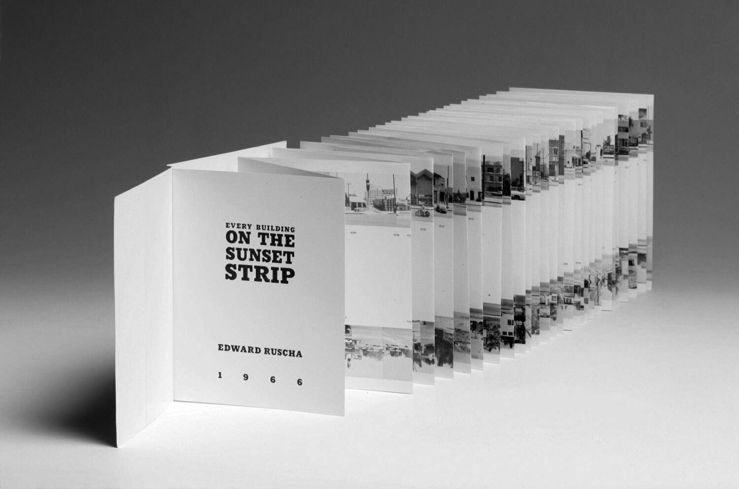
Ed Ruscha
Every Building on the Sunset Strip 1966
For the changing light aspect of my project, I was inspired by Monet’s Rouen Cathedral series, particularly in the way it expressed how light changes throughout the day/year and its effects. I was also influenced by Andy Warhol’s film Empire, even though I found it somewhat tedious, the sentiment rang true to my project. Towards the end of the fall semester I discovered Ed Ruscha’s Every Building on the Sunset Strip and was inspired yet again. I decided then that the final presentation for my series would be a book with accordion-style pull-out pages for each building/subject. This would allow the reader to view the images one by one while flipping through the pages and also, each series as a whole, if the accordion-pages are pulled out. My new subjects would be ubiquitous Houston buildings located downtown, buildings that promote regional identity but are often overlooked. This time, I started out by photographing each building 4 times a day (the 4th being an image displaying the lack of natural light and presence of artificial light). While taking wide angle photos with my 24mm t/s lens I would also take a “zoomed-in” detail shot of the façade with my 70mm lens. When piecing together the series with my advisor, we came to the conclusion that the close up “detail” shots were much more graphically interesting and better displayed the intention of my project.
As I began to hone in and photograph the rest of the series of the project, I made a set of rules to follow in order to maintain consistency throughout the project.
1. Full clear sunny days only
If shadows fall on subjects, it should be because of the suns position or their surroundings – not inconsistent weather.
2. Time-frame between images should be consistent and orderly
Morning ~10am, Noon ~12:30, Afternoon ~4:30, Night ~8
3. Direct front facing one-point perspective compositions
To maintain compositional consistency
4. Compose for square format
Only square crops used for compositions to maintain consistency and reference building blocks, modules, tiles, fragments, etc.
Originally, the series consisted of a list of twelve buildings. After the school shut down because of Covid-19 and Houston issued stay at home orders, I had to condense my list and finish the project with seven. Even though the series was cut short, I am happy with the results and would like to continue it (possibly in a different city/subjects) one day. I learned a lot from this project. I found the process of going out and experimenting before fully fleshing out the specific details of the project at the start to be was extremely helpful. In the beginning of a project when there are still a lot of unknown factors, simply going out and testing your ideas is important. Rarely does a project stay the same from beginning to end. Looking back, I can say that, learning how to identify problems and adjusting your project accordingly will lead to a more fully developed and rewarding final result.


